On Orders $49+
On Orders $49+

Revisit elementary school art class as we review the color wheel and explore paint colors that play well together.
Exploring the color wheel is an excellent undertaking for any artist. Understanding the relationship between colors can help you select paint colors that work well together and convey the mood or effect you want. Color theory also allows you to anticipate the results of mixing paint colors and to avoid accidentally creating muddy colors.
The traditional color wheel is a circle filled with 12 pie-shaped wedges. The colors on the wheel are divided into 3 groups and arranged to show their relationship to each other.
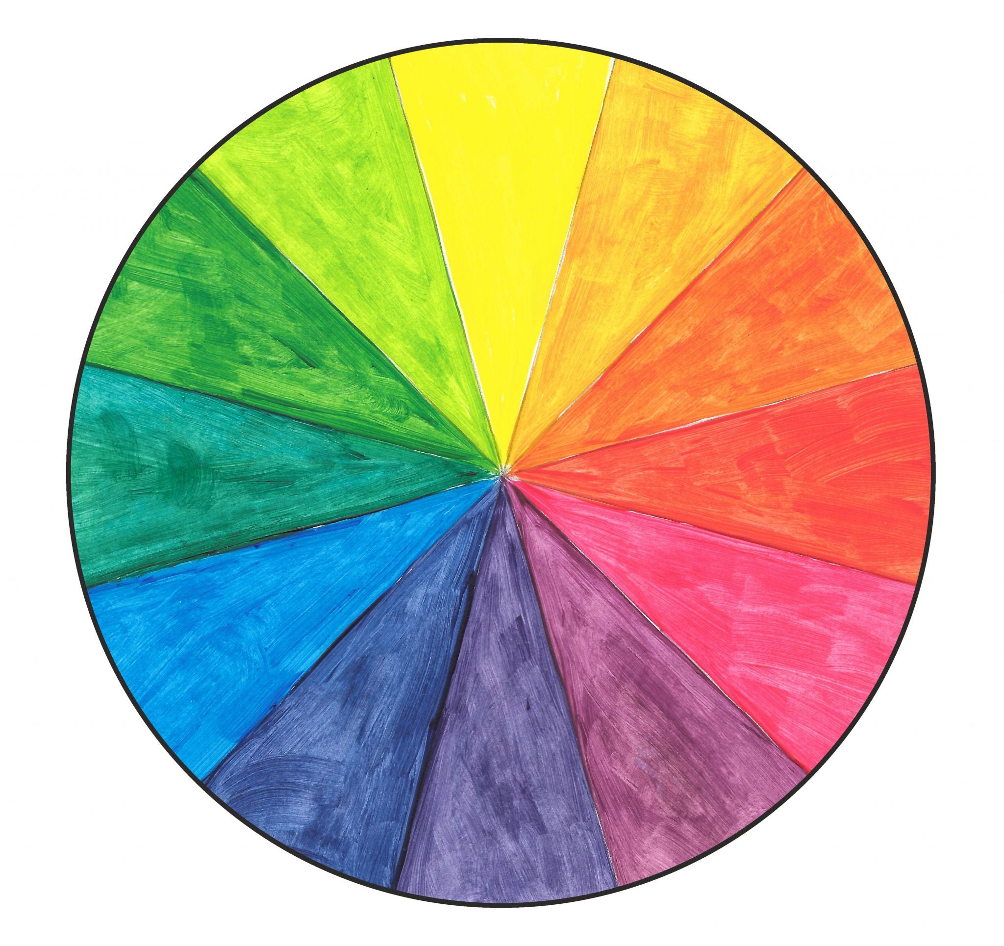
Primary
Three wedges are primary colors: red, yellow, and blue.

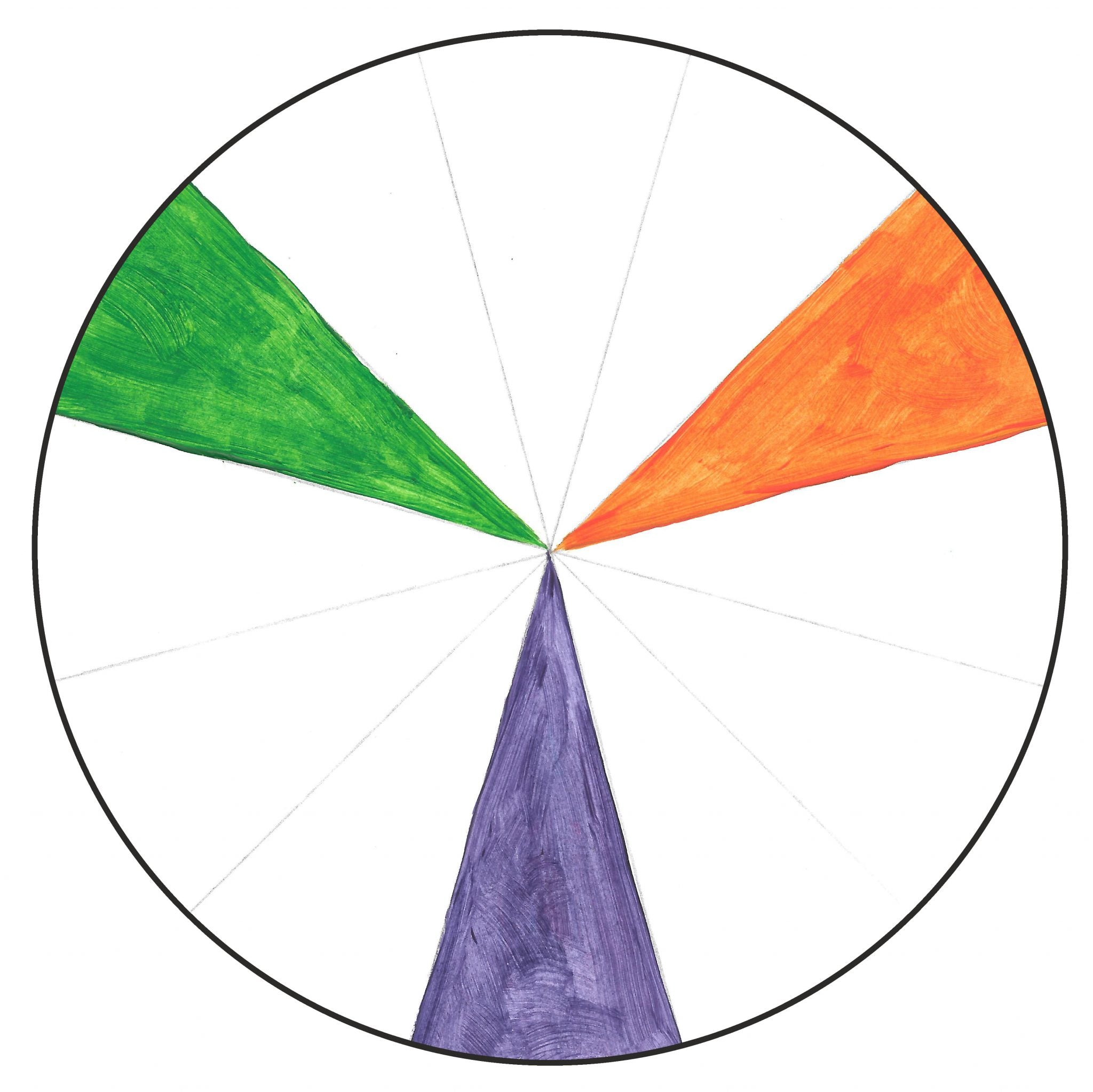
Secondary
Three wedges are secondary colors: green, violet or purple, and orange. These colors are made by mixing together equal parts of 2 primary colors.
Red + Yellow = Orange
Red + Blue = Purple
Blue + Yellow = Green
Tertiary
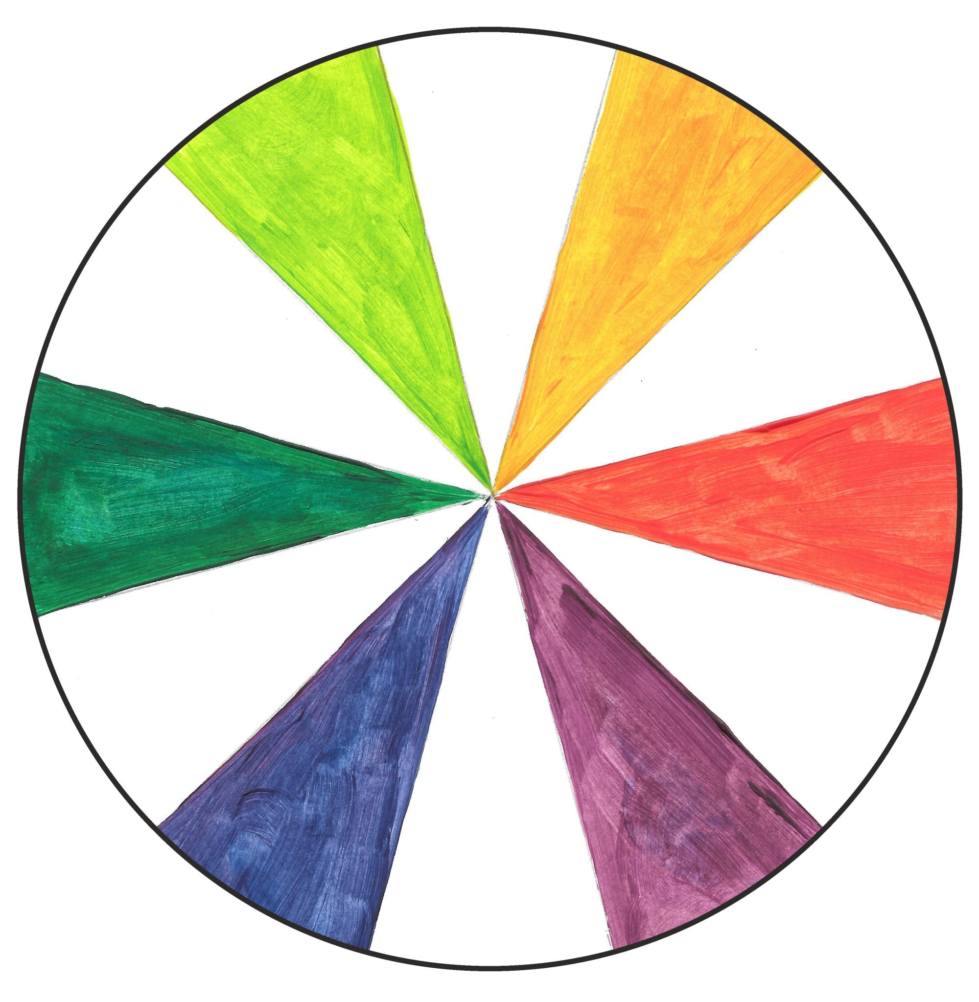
Six wedges are tertiary or intermediate colors: yellow-orange or orange-yellow; yellow-green or green-yellow; blue-green or green-blue; blue-violet or violet-blue; red-violet or violet-red; and orange-red or red-orange. These colors are made by mixing together one primary color with an adjoining secondary color.
Red + Orange = Red-Orange or Orange Red
Red + Violet = Red-Violet or Violet-Red
Yellow + Green = Yellow-Green or Green-Yellow
Yellow + Orange = Yellow-Orange or Orange-Yellow
Blue + Green = Blue-Green or Green-Blue
Blue + Violet = Blue-Violet or Violet-Blue
Additional colors are created from these basic 12 by mixing in white, black or gray paint. A color with white paint added is called a tint. The addition of black paint creates a shade. Gray paint added to a color makes a tone.
Color Wheel Challenges
When it comes to colors, one challenge artists face is that names on paints from the store do not always match the color name you’ll find on the color wheel. Here are some common paint colors and approximately where each fall on the wheel.
Another challenge is that primary colors are not all the same. One paint labeled yellow is not necessarily the same as the next paint labeled yellow. Instead, most lines of paint include “warm” versions of the primary and “cool” versions. Warm colors lean toward yellow and cool colors lean toward blue. Whether a primary is warm or cool affects the secondary colors that result when the paints are mixed.
This warm color wheel illustrates the beautiful red, orange, and yellow colors possible from warm yellow and red primaries. These warm primaries also create some lovely green shades. But what happened to purple? The colors on the violet side of the color wheel are muted, tending toward browns, because of the “yellow” present in the blue and red primaries.

In contrast, the color wheel using the cool primaries yields orange and red colors more closely resembling terra cottas because of the “blue” in the primaries. These greens are also lovely, but brighter, and more typical violet colors are produced.

Color Mixing Tips
Artists are often careful not to mix colors opposite on the color wheel together because they make “mud.” That is, opposite colors – blue and orange, red and green, and purple and yellow – create dull neutral colors when mixed. But sometimes you want mud! By using colors from your painting to create neutral browns and grays, those neutrals will automatically go with the rest of the colors in your work.
Add a little dark paint to a light paint – not light paint to a dark paint. Considerably more light paint is needed to lighten a dark color than vice versa. Add a little opaque paint to transparent paint for the same reason.
The color mixes in this article all were created using student grade paint. One of the drawbacks to student grade paint is that colors often contain a mixture of pigments to approximate a more expensive paint pigment. When you’re ready, upgrading to an artist grade paint will allow you to work with single pigments.
Experiment
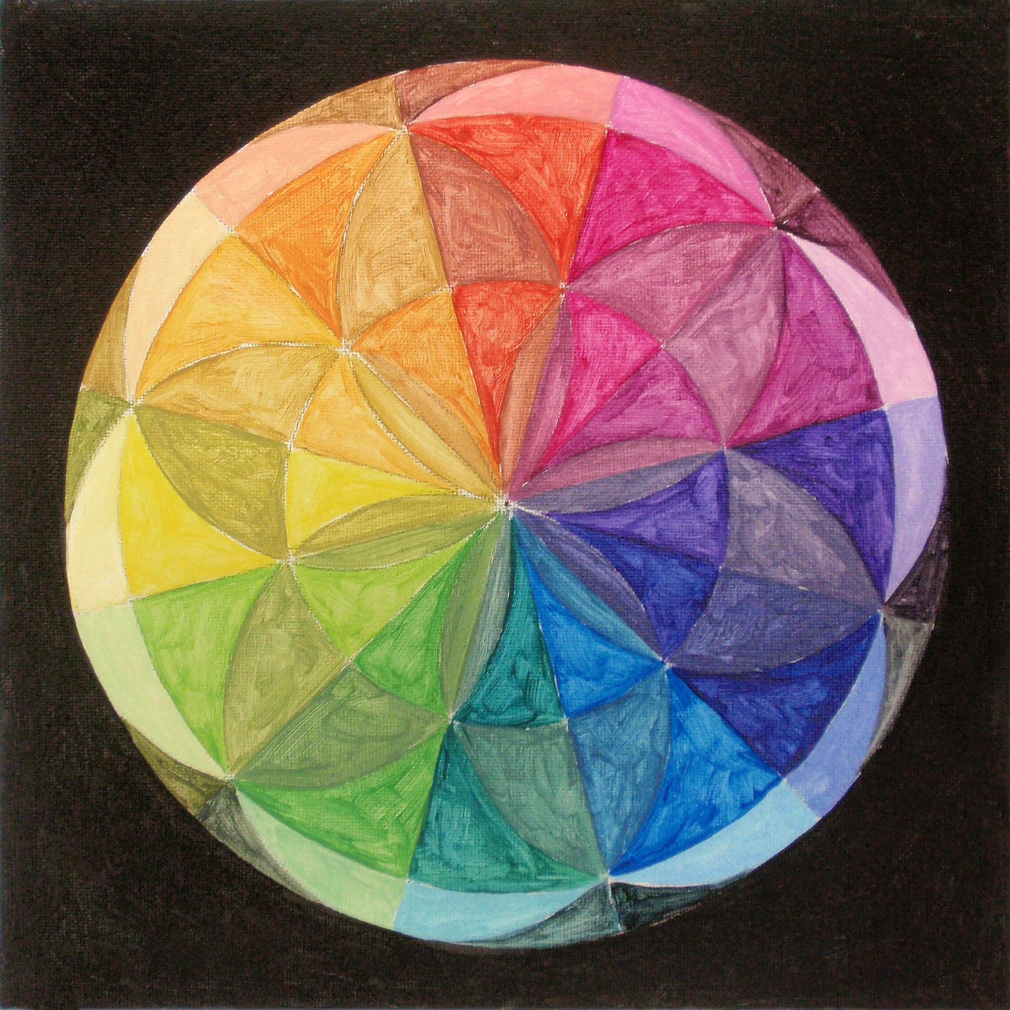
Of course, the best way to understand what happens when you mix paint is by mixing paint! If you’re working with a paint set, pull out the primary colors and do these same paint experiments with your own supplies. Keep your experiments on hand in your studio to use as a reference when painting. Or turn one of your experiments into this beautiful mandala painting!
Supplies
Canvas Board, 10×10 in.
Compass
Ruler or yardstick
Protractor
Pencil
Paint in your choice of primary colors (red, yellow, and blue) plus black, white, and gray)
Paint brushes, angle shader and round detail
Step-by-Step
Apply gesso to your canvas board if needed. Allow to dry.


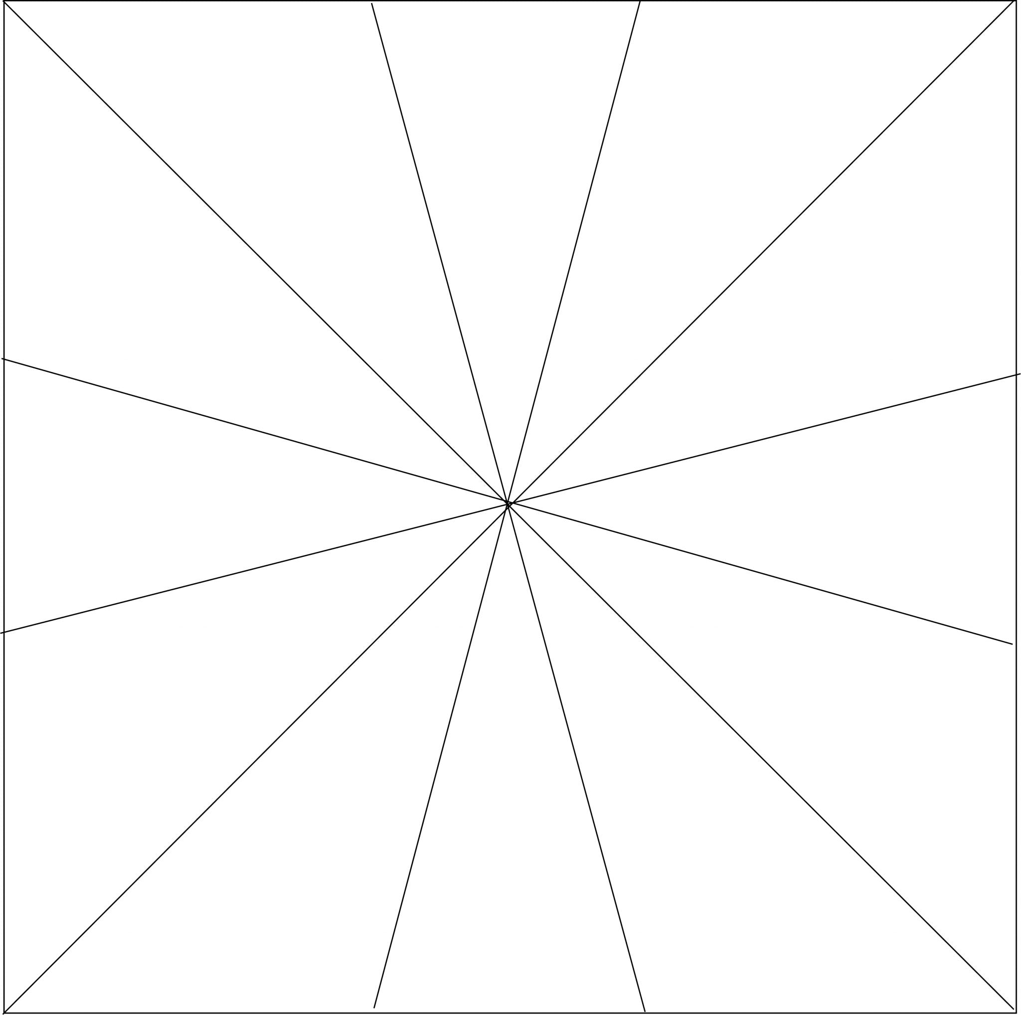


Choose your favorite trio of primary colors and paint each wedge of the mandala using one color from the color wheel – plus its tint, tone, and shade. (Remember: add white paint for the tint, gray paint for the tone, and black paint to create the shade.) Select a pattern placement for the color-tint-shade-tone in the first wedge and carry this pattern out with the other colors and wedges. Paint the background black.

All About Paint: Which Paint Do I Use?
Color Schemes using the Color Wheel Plus Free Magnet Pattern
Leave a comment